Posts

Final Project Blog

Image
Artist Statement:  I made this art piece because it consists of everything that I have created in the class Digital Media. In addition, I believe that this final project does a great job demonstrating who I am. What inspired me to make this art piece is consolidate all the projects that I have created throughout the semester into one consolidated artwork. It illustrates all of my memories and experiences that I had the opportunity experience until this point in time. I believe that people should care because I hope that this consolidation of projects inspires people to create a project to share their story. I believe people should care about this because I believe this artwork allows people to reflect on the things they have accomplished in the past.  This artwork of my final project represents my personality, characteristics, and story. My artwork demonstrates this because all the artworks within my final project has a symbol that I have a happy memory tied to or symbol that I believe

ID H1 Blog

 Links: https://www.youtube.com/watch?v=AshfNo-i8Ws  1. I think an easy tool to use would be the direct selection tool. I believe that this would be an easy tool to use because it seems pretty straight forward. It is also customizable to how I would like to shape my image. A tool that I think would be difficult to use is the scissors tool. I think this would be a difficult tool to use because of the angles and how to maneuver a shape would be difficult. If drawn incorrectly overtime, it can ultimately lead to creating an odd shape overall. I think these tools would be great on whether I want to move or cut an image. What I found interesting about the video is the straight forward directions of how to use each tool.  https://www.youtube.com/watch?v=LgDHgFZIaEQ 2. A tool that seems easy to use is the type tool. I think this would be an easy tool to use because it seems pretty straight forward of how to use. A tool that seems difficult to use is the pen tool. I think this seems like a dif

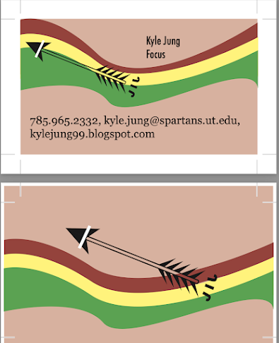
Business Card Blog

Image
Artist Statement: I made these three different business cards as a way advertise myself. What inspired me to create these business cards is to demonstrate the three different characteristics of myself to the world. The first design shows the positive outlook I have on the world. The second business card demonstrates the curious aspect that I have. Lastly, the third business card demonstrates the understanding and easy going characteristic that I own.  I believe that people should card because it the artwork I create is meant to pitch myself and connect with. In addition, it gives people a way of how I can be remembered as with the logo. The artworks all have different designs but demonstrate who I am. With the logo stamped on all three business cards, it entails my true character of being a focused and free flowing individual. What makes my artwork unique is the logo design and choice of colors as I believe show my true colors. What this means to me is how I would like my contact infor

Somewhere Blog Post

Image
  The reason why I chose to incorporate myself into this scene of the show Rick and Morty is because of the amount of humor and random actions taking place in the scene. Also Rick and Morty is my favorite television show. The scene is about a universe where pizza is used as furniture, phones are the people in society, and people are considered as food. The phone on the left is placing a pizza order with people as toppings and to add to the randomness occurring in this scene, I thought it would be fun to incorporate myself smiling at the television as the red phone is placing a person pizza order. I think people should care because as busy and caught up everyone is with their everyday job, I believe as emotional human beings we should not forget to laugh once in awhile. In other words, people should care about my artwork because feel free to laugh when viewing my artwork because of the amount of randomness and the bizarre things occurring in this scene of me in it.  My artwork represent

Photoshop Homework 2

Image
  1. 2. 3.  4.  1. I believe that the photo of Kirby with Kayne eating breakfast together would be a difficult image to photoshop. I think this would be a difficult photo to photoshop because of the amount of detailed involved in the image. I think that there are lot of small details that would be difficult to detail such as the background and the spilled milk. In a addition, capturing the small details of the cups and mugs would be difficult to enrapture because of the sizing.  2. This image gave me the inspiration to travel to California. The inspiration that gave me to want to travel to California is the color of the lighting used in the background. In addition, the Average Rob looks so happy being out in the dry heat. Another reason why this picture inspires me to want to travel to California is because the background used in the image reminds me of the seen in Iron Man where Iron Man is eating the donut at Randy's Donut shop which is a location I've always wanted to visit.

BW to Color

Image
  Artist Statement:            The reason why I made my art is because each portrait demonstrates the different emotions that I envision when I think of the corresponding colors. The first portrait colors represents my emotional feeling of accomplishment. The second portrait portrays my feeling of anger. The portrait represents when I am in a relaxed state of mind. What inspired me to choosing the colors I did is because I believe that they all represent different spectrums of feelings in correspondence to the atmosphere and my feelings based on the set circumstance.      I believe that the audience should care because the colors that I utilized in my portraits symbolize emotional feelings that can enlighten their mood. In addition, as people we tend to correspond colors with emotional feeling and I believe the colors that I chose encourages a positive mindset. I believe that my portraits enforce positivity because they are all bright colors which has been correlated to staying positiv

Logo Tag Brush

Image
  Artist Statement:  The purpose of why I created this art piece is to show the audience who is Kyle Jung. The arrow in the artwork is to demonstrate that Kyle is a goal oriented person and the initials "KJ" is secretly hidden in the arrow similarly to how Fedex hides the arrow in their logo. The purpose of creating this aspect it to demonstrate that I do not like being the center of attention and prefer to focus on a goal in privately. What inspired me to creating this artwork is that life is more enjoyable when you have a set goal in mind whatever the case may be. I mention this aspect of goal orientation having a set plan of where you envision yourself being five to ten years down the road only makes the drive to getting up more exciting and rewarding when you reach a milestone.  The artwork is to demonstrate who I am as a person which is a goal oriented person that is driven. In addition, the artwork is designed to replicate the Korean flag symbolizing that I am Korean. T